From tomorrow (Wednesday 2nd March), you’ll notice some changes we’ve made to several of our account codes features which will have a positive effect on your overall user experience when using these tools.
In case you’ve not used them before, account codes are a way of separating costs and income for your business by certain areas or departments, such as rent, equipment, and interest income.
What are the changes we’ve made?
1. Icons in list of account codes
Previously, when viewing your list of account codes ( Settings > Codes ) there was a Manage drop down menu by each code, as seen below, to allow you to either edit or delete the code. 
As there were only 2 items in the drop down menu, we’ve replaced this with icons for Delete or Edit. Additionally, sometimes the ‘Delete’ option is disabled for some codes so you can now hover over this icon and see an explanation for why it’s not available. Both these changes mean it’s now much easier and clearer to see what options are available to you.
New layout
2. Adding/editing account codes
We’ve made some changes to greatly improve the user experience when editing/adding an account code and an account type (Settings > Codes > Create).
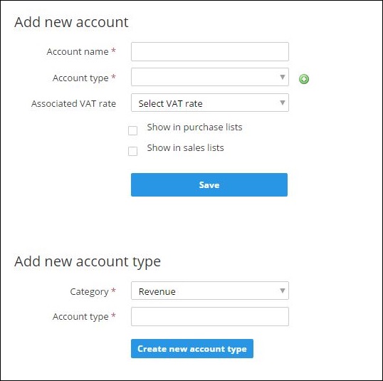
Previously, if you were editing an existing account code and then wanted to add a new account type to be associated with it, this was done using 2 separate forms on the same page as shown below. However, you would have to fill in and save both forms separately.
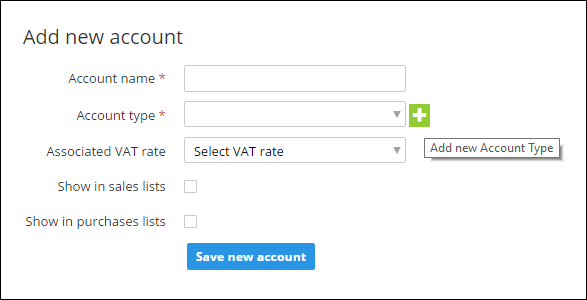
We’ve improved this process and reduced the number of clicks/steps required by condensing these actions into one form. There’s now an Add new account type icon which allows you to enter this information in the same process.
New layout
You can also see that we’ve changed some of the labels on forms and buttons, making them much clearer for the user.
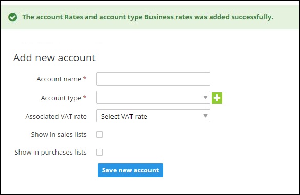
Once you’ve saved the changes, there’s now a clear notification of exactly what information has been saved/ added.
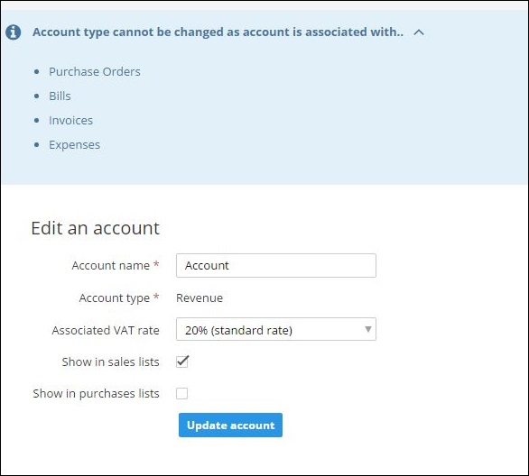
3. Explanations for why you cannot change an account type
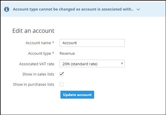
In various cases, you may not be able to change an account type. We’ve added notifications to give you the specific details of why this is on each occasion.
We’ve made these notifications unobtrusive, and they can be expanded for more information or hidden. They are also mobile and tablet responsive and are consistent in style with other similar notifications within Clear Books.
Below you can see an example notification, and how it can be expanded for more information.


