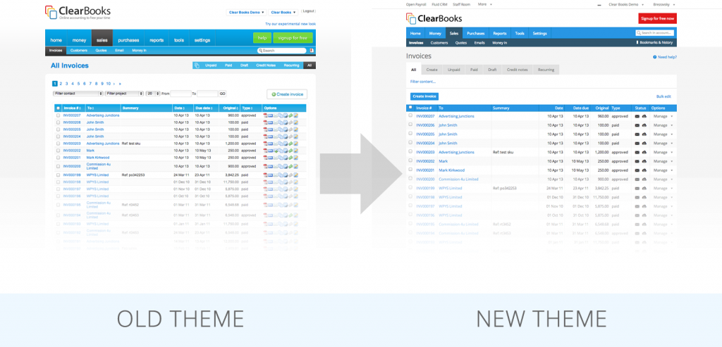
If you’re an avid reader of the Clear Books blog you will already know that we have been working our fingers to the bone designing a new theme to make Clear Books even more fantastic than it already is! And how have we made sure that it’s great? We’ve been taking your feedback every step of the way and using it to mould how you see and use Clear Books.
I am now very pleased to announce that the theme is going to be rolled out to everyone in the next couple of days. To take away the element of surprise, please see below for a picture of what the new theme looks like:

You might ask why we have redesigned the software. It’s simple – we’re always looking for ways to make Clear Books more intuitive, attractive and more…you.
Clear Books only exists because of you guys, our valued customers, and we need your feedback because we want you to be happy with the software we are providing.
If there is anything that you find difficult to do in the new theme or if you have any ideas about how we can improve, please make sure to drop us a comment in the Network.
Lets make Clear Books amazing, together!

Hello Anne,
The account codes are sorted by account code number. You can turn on alphabetical ordering in the Settings -> Organisation -> Toggle Features -> Alphabetise account codes
I just switched back from the new theme after trying it for 2 weeks. It has lots of issues in Firefox on Linux. Hopefully you’ll have these fixed before 22nd.
Personally I think the old theme is more pleasing on the eye and the font’s are much easier to read on the old one. I can see that you have moved towards a theme that is akin to the new microsoft and HP one since windows 8 has come out. Looks a bit drab though (so do their’s). I don’t use a touch screen so if its designed for a tablet perhaps its ok for those who do.
Hello Hugo,
Thanks for the feedback. We will take it into consideration. We should come up with a better typography pretty soon with larger text
Cheers,