As part of an ongoing plan to improve our product, Clear Books is pleased to announce that its New Theme will go live on 31 October 2016.
This has been available in Preview, to all users for several months and has been used by half of all new users since March 2016.
With the objective of making Clear Books easier and more intuitive to use the new theme has been designed to improve the user experience, both in terms of a more modern look and feel and in moving individual features to more logical positions within an improved menu structure.
The result is that the new menu structure is less cluttered and navigating to features and functions takes up less screen space.
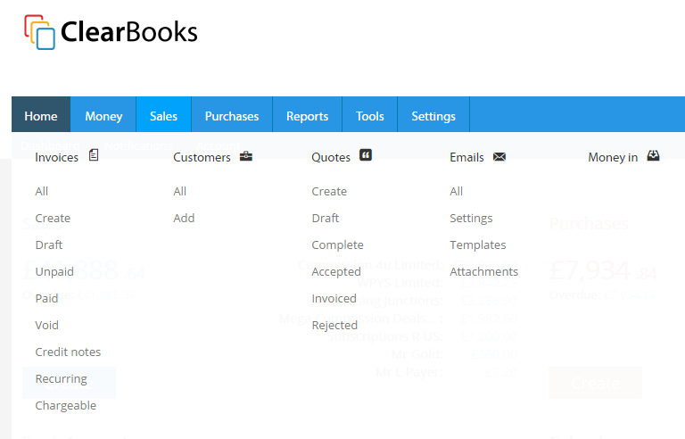
For example here’s a comparison of the Sales tab under the current theme:

And here is how it looks under the new theme:

The most notable changes to menu structure and feature positions are as follows:
- The Home tab is gone and your starting place is now the Dashboard.
- Customers & Emails (currently in Sales) and Suppliers (in Purchases) have moved to a new Contacts tab.
- The Tools tab now incorporates Dividends and Yodlee integration (currently in Money and Purchases).
- Getting started (currently in Settings) is now a sub menu of Dashboard.
In support of the new theme launch, the most popular user guides have been updated to reflect the new theme and others will follow over the next month or two.
A short video demonstrating the new theme and covering the main changes to menu content and structure can be found below

