Last Friday we posted about the New Navigation Bar which you can enable in Labs. We could not go a week without blogging about our latest progress!
You will now have access to our new set of buttons which have been introduced to match the new Clear Books navigation bar and to improve the consistency of buttons and links across Clear Books.
Without further adieu, here are the buttons with their representative action:
At the moment these buttons are a one-to-one replacement of the old buttons and may not be 100% representative of their actions. Their actions will be evaluated in the near future and the correct colour will be given to them.
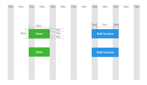
The image below shows how these buttons fit within our new ‘grid system’ we opted for the new theme. All elements will have a uniform width and height and will fit along a grid for a clear and fresher look.
An example of how buttons are currently inconsistently used in Clear Books can be seen in the image below:
As you can see in the image above, all buttons have the same colour, even though they should not. Going ahead with the new buttons, we will ensure that consistency is maintained throughout Clear Books.
Please don’t forget to give us your feedback! We really appreciate it and we always take it on board.


