As you probably have already noticed (unless you are technically trendy and are reading this post through an RSS reader) the Clear Books website has had complete re-design. The new design aside from being aesthetically pleasing to the eye focuses on organising the vast amount of posts into a more searchable and accessible manner.
Customer Driven Home Page
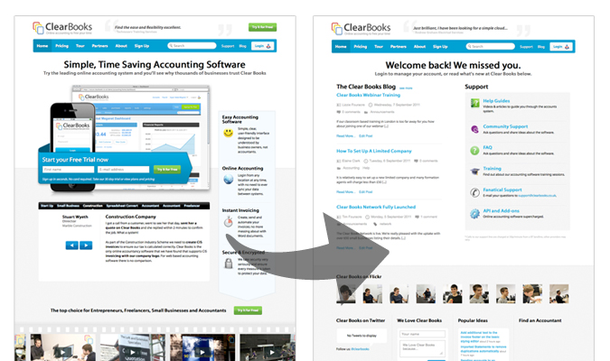
One of the main pieces of feedback we have received from our customers is communicating what’s currently going on at Clear Books and in particular highlighting new features and announcements. We have always communicated this information through our blog and through Twitter, so unless you specifically visit one of those sources chances are you would not discover the new feature, unless by pure coincidence.

With the new design of the Clear Books website we have created a customer driven home page which aims to deliver all of this content in one place, directly in front of you. We do this by setting a cookie on your computer when you logout of your Clear Books account,which we check for when you return. If the cookie exists you will see the ‘customer homepage’, if not then you will see the standard ‘marketing homepage’.
Help Guides
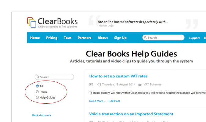
Prior to the re-design help guides were posted under the Clear Books blog along with all of the other posts. This unfortunately made it incredibly hard to find the information you were looking for through searching, as often search results would return others posts matching your search term as well.

In the new design, we have completely separated the Clear Books help guides into a new custom post type and have created a new page under which all guides can be found. In addition to this we have also extended the search, providing custom filter options so that you can search either All content, blog posts or help guides – which should make finding the information you want a lot easier.
Clear Books Team Profiles

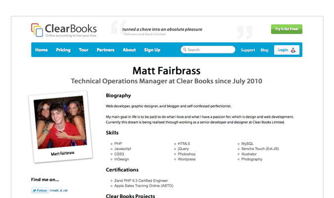
As part of the new design we also wanted to highlight more the incredible team of people we have working at Clear Books. As such we have now introduced new team profiles so that our customers can find out more about the people behind the product. The team profile pages also enable you to filter posts by a specific author introducing yet another improvement the new design brings to making information on the site more accessible.
I hope you like the new design as much as we do. What do you think about the new design? Do you have any suggestions on how we can make it even better?
