As I’m sure many of you are aware, we have been working hard to improve the look and feel of Clear Books with our new user friendly theme.
If you haven’t yet experienced the sleek new theme, enable it today by clicking the ‘Try our experimental new look’ link in the top right hand corner of your Clear Books account.
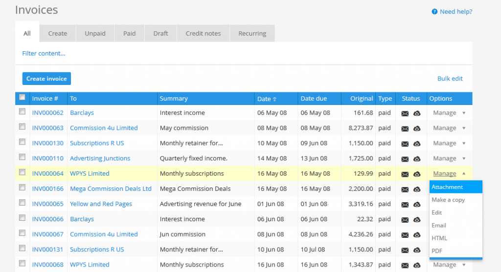
The latest additions to the evolving new theme are the improved invoice list tables. These are the tables that display an overview of your sales and purchase invoices which are now less cluttered and easier to use.
Here’s what’s new:
– Filter options are hidden until set.
– All action buttons are in one location.
– Buttons are hidden until a row has been selected.
– Icons in the ‘Options’ column have been converted to words and tidied away into a drop down box.
– Click anywhere on a row to select that row.
– Table width has been extended, optimizing more of the screen.
We can’t wait to hear what you think about these improvements so please let us know by commenting on this blog post.


Thanks Tim – we’re looking into that. To answer your question about the purpose – it is to tidy away the filters for first time users really when they are not necessary. Once you click on the ‘Filter content’ it will stay shown until you want to hide it away.