A shiny new look for Subscriptions
Our product team have been hard at work transforming the subscription area to make it clear and simple for you to manage your subscriptions with Clear Books. Today, we’re releasing ‘Part 1’ of our improvements.
What changes will we see in Part 1?
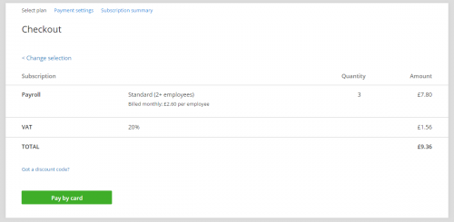
- Introducing the checkout page allowing you to clearly see what subscriptions you are signing up for
The checkout page lets you review which plan you have selected, apply a discount code, and see a breakdown of VAT. You are also able to go back and choose another plan or payment method should you change your mind. This helps you to check that you’re happy with everything before confirming your selection and paying.

Why have we made this change?
The fresh new look brings further consistency to our application as we gradually switch over to the new style.
We also learnt that some customers found our subscription area confusing so we read all of your feedback and used it to create a better experience.
Who will use it?
All our customers at one time or another will find themselves in our subscription area, but in particular new customers and accountants.
How do I start using it?
Just head to the subscription area, the changes are live for everyone now!
We’ll continue to communicate the details of each release, so keep an eye on our blog and Community forum over the next few weeks.
Enjoy the new pages and keep an eye out for more in the near future!
The Clear Books team
