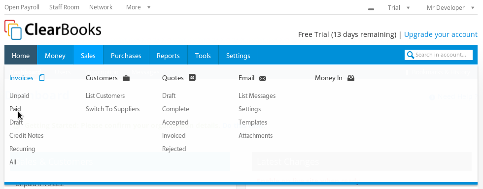
What once took 3 clicks now takes 1! Following on from the previous blog posts about the new menu navigation bar functionality and the new navigation bar design we are proud to let you know that the new navigation menu is live in Labs!
The new menu bar allows you to navigate through Clear Books much faster but also provides a fresh look to your favourite online accounting software!
Here is a sneak peak of how the new navigation bar looks:
New navigation bar with global application menu

The hover box which allows you to quickly navigate ClearBooks!
Richer group dropdown lets you filter your groups!
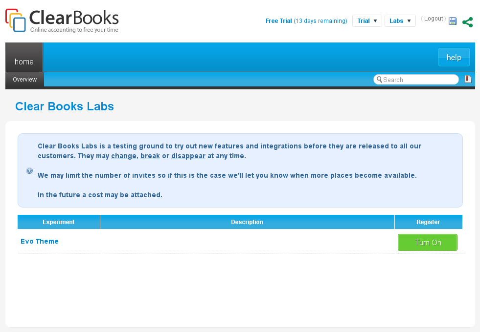
In order to get your hands on this revolutionary new menu bar, you will have to enable it in Labs. Do this by choosing ‘Labs’ from your services drop down menu where you will see the option to switch the new theme on.
We would love to hear your feedback so feel free to comment below!
Please note that the new menu bar is still in ‘beta’.


Thanks for your feedback! A delay on hover will be live very soon!
We always listen to our community! That’s how we roll
Thanks for the feedback! We will reconsider the font size. You should now be able to see the Partner link in your services.
The font size being so small is an issue for me personally but like the new top menu.
Hi James – thanks for the feedback. Where do you mean specifically – the body content or in the menu hover or somewhere else?